Experience
OVERVIEW.
Every summer, fans head to Halas Hall across 13 public Training Camp days. All of them just excited to experience what’s in store.
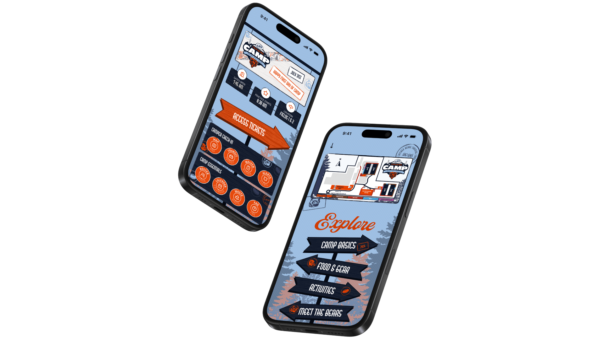
The Training Camp Companion Guide is the official app for those days: it houses everything fans need to know before they arrive, plus a custom map of the facilities so they can find every activity on-site.
Over five-weeks, I led the app's design end-to-end — from auditing the previous year's manual to designing, prototyping, and shipping the version that reached 26,000+ fans across 13 public training camp days.
PROBLEM.
How do you connect with fans on where they need to go, what there is to see, and what to know about the venue?
The previous year's Training Camp manual was spread across dozens of redundant screens, each offering its own path to similar information. Fans had no single, reliable way to answer two basic questions: where do I go, and what's here to see?
My goal was to cut through that cognitive overload with one clear navigational structure. One map and only the information fans actually needed before and during camp.
RESEARCH.
I started by auditing the previous year's Training Camp manual screen by screen, roughly outlining every existing screen and function to see what was actually being used and what was just redundant.
That audit made the core issue clear: the navigation itself was the problem. Fans could reach the same information through too many different paths, with no consistent structure to follow.

BRAND & STYLE.
Before sketching anything new, I met with the Bears' brand creative team to align on that year's visual direction and overall vibe for camp, so the app would feel consistent with the rest of the season's creative.
LOW FIDELITY.
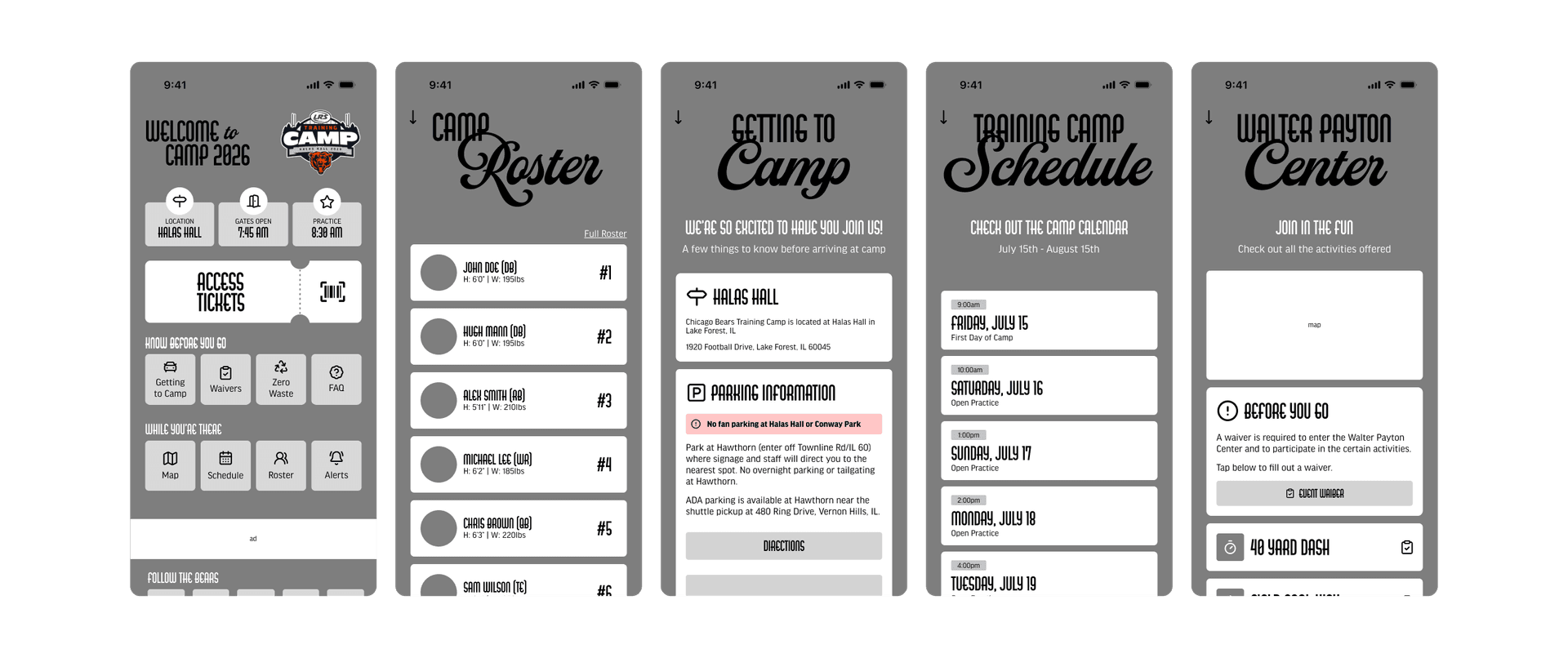
With the navigation problem clearly mapped out, I moved into low-fidelity frames focused on two things:
- A single, clear navigation structure
- What essential information was needed
HIGH FIDELITY.
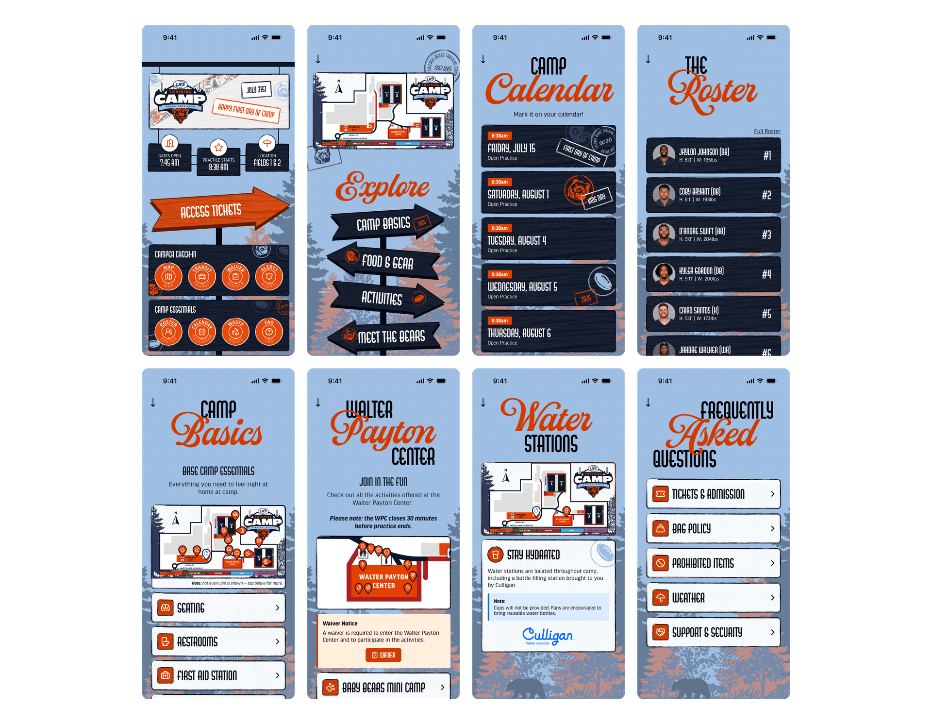
Once the low-fidelity structure functioned, I layered in color and brand styling to build out the high-fidelity screens, working closely with brand creative and the rest of the Digital Product team on writing and content.
PROTOTYPE.
A third pass turned the static high-fidelity screens into an interactive prototype, letting reviewers click through the actual navigation and map instead of just looking at flat frames.
That prototype went back out for another round of feedback before development began.
IMPLEMENTATION.
I then built the app out 1:1 in Rover, the system the Bears use to ship their digital products.
From there, it went to an administrative review group of 70+ people across the organization for a final round of feedback, which I incorporated before pushing the app live.
LAUNCH.
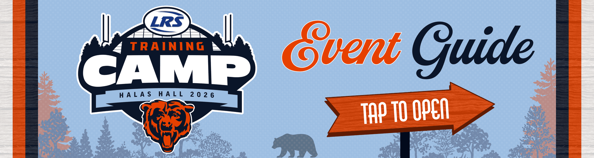
After incorporating that feedback, I designed the promotional graphics for the app and pushed it live in time for Training Camp, reaching 26,000+ fans across 13 public training camp days.
WHAT I LEARNED.
Starting with an audit of what already existed, rather than jumping straight to new screens, made the actual problem much easier to see, interate, and solve for.
Working cross-functionally with brand creative, events, marketing, social, digital, and partnerships (+more) kept every detail on screen accurate. From schedules, locations, and activities that fans could actually rely on, not just a design that looked right.