The Rush
OVERVIEW.
60,000+ fans. One stadium. Hundreds of staff who need to know exactly where to be and what to do, the second they walk in.
The Employee Gameday Guide is what stands between that chaos and a smooth gameday at Soldier Field — the single reference every staff member turns to for logistics, procedures, and on-the-ground answers. I redesigned it so that reference actually works under pressure, not just on paper.
PROBLEM.
The old guide was fighting the exact moment it was supposed to help with.
Formatting was inconsistent from section to section, and information was crammed into dense, uninterrupted blocks of text. Finding one specific answer meant reading through everything around it — fine at a desk, unworkable on a gameday floor.
With 60,000+ fans in the building and staff moving fast, the guide needed to work in seconds, not minutes. It wasn't doing that.
PROCESS.
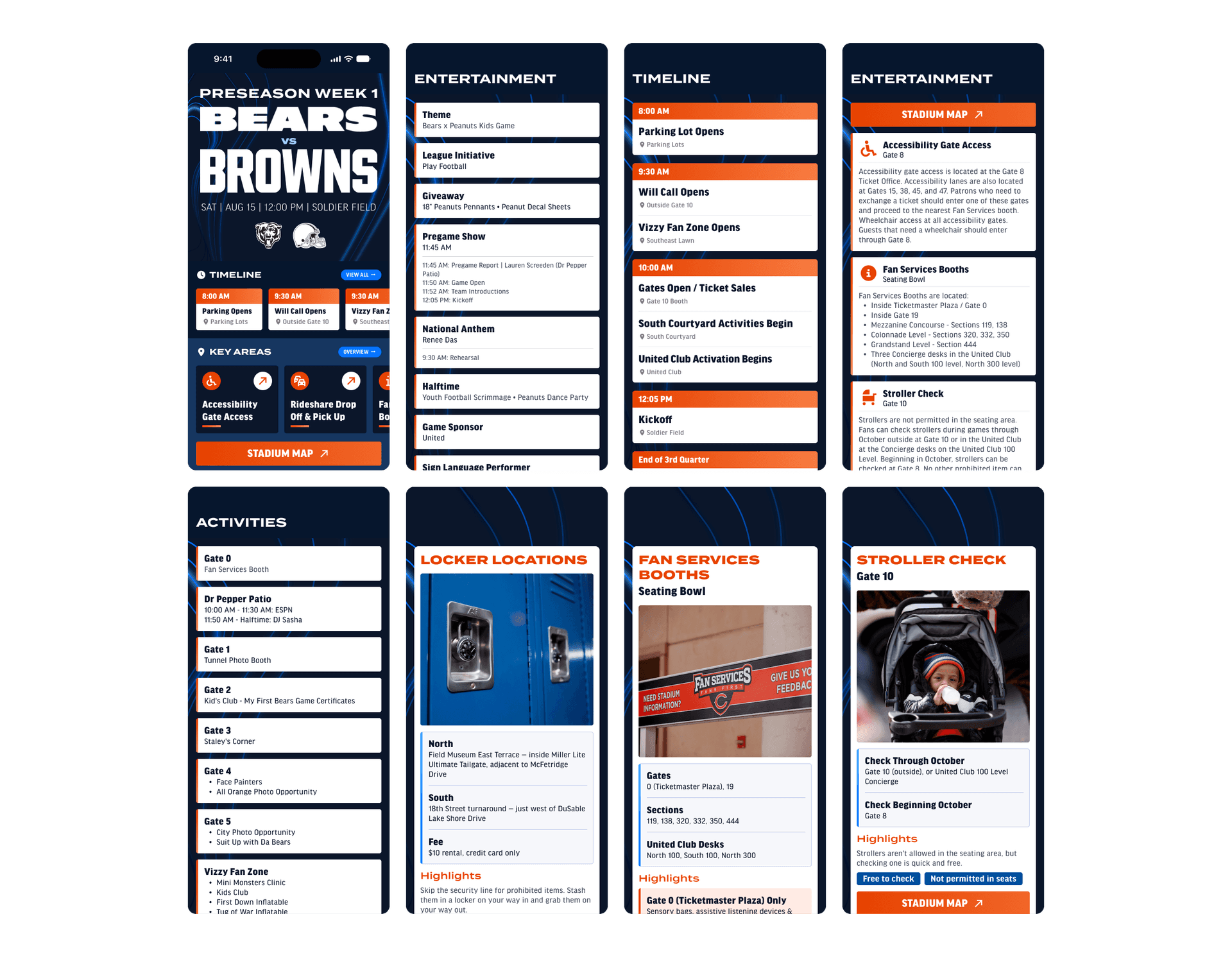
No rebuild. No reinvention. I went straight after the actual friction. Every section got broken down into clearly chunked, scannable pieces instead of dense paragraphs, with consistent formatting applied across the entire guide so staff always knew where to look.
Visual hierarchy did the heavy lifting: the most time-sensitive, most-needed information was made impossible to miss, while supporting details stepped back instead of competing for attention.
Small tweaks, applied consistently and with intent, turned a document that had to be read into one that could just be scanned.
LAUNCH.
The redesigned guide shipped to production and is now the standard reference hundreds of gameday staff turn to at Soldier Field, in use on every single home game.
WHAT I LEARNED.
The best design doesn't need to be flashy: it needs to be functional. Nobody opening this guide mid-gameday cares how polished it looks; they care whether they can find their answer in five seconds or fifty.
Some of the highest-leverage design work isn't a new interface, it's clarity applied to something that already exists.